DISTRIBUTION
Distribution is a pricing tool that helps users price and manage their inventory in the secondary market of the live event ticketing world. The ability to make quick and smart pricing decisions is crucial when selling tickets.

Overview
When pricing tickets, users of Distribution cycle through multiple events during the day. These efforts are more frequent when teams and organizations need to stay aggressive with their pricing as they approach closer to the event date.
The goal of this project was to empower users in pricing tickets and maximizing their efficiency. A clutter-free interface, improvements to system performance, clear feedback, and consistent visual language were key milestones for this project.
My Role
As the sole product designer, I was responsible for delivering end-to-end design workflows and other key deliverables. To reduce noise when communicating my ideas to devs, I created a design system - Qx Design, to help the dev team follow a uniform style guide and pattern library.
As a member of the product team, I worked closely with my product manager and VP of Product in understanding business goals. To get a better sense of user pain points and needs, I was in constant touch with the customer success team who worked directly with the clients and product. I collaborated with the dev team in understanding the technical feasibility of certain ideas and in communicating my design intentions to them.
Timeline
4 months
Output
A redesigned web & mobile app
Team
Product Manager, Customer Success, Developers (2)
Responsibilities
User research, design strategy, ideation, interaction design, design system creation and management, prototyping, user testing
THE PROBLEM
Maximizing the pricing experience
The user's primary action takes place on what we call the 'Pricing' page which hosts events, strategies associated, and other relevant information that helps a user make informed pricing decisions.
Given the high-activity nature of the page, users may struggle to complete actions within a reasonable time. They need to be able to make quick decisions with as little effort as possible. Having poor access to key features on the go further hinders user experience.
THE RESEARCH
Understanding the user workflow
Through interviews and analytics data, I found that several features on the pricing page were unused by users. Many were unaware of their functionality. By the end of my research I had hoped to get a better understanding of the following:
- What features were being ignored by users?
- Why were they not part of an everyday user's workflow?
- What features do they use on a daily basis?
- What visual elements do they interact with in order to complete their workflow?
Digging deeper
Once I gathered responses and data for my questions, I conducted a UX audit of the pricing page to identify any visual bottlenecks and make note of current functionalities.
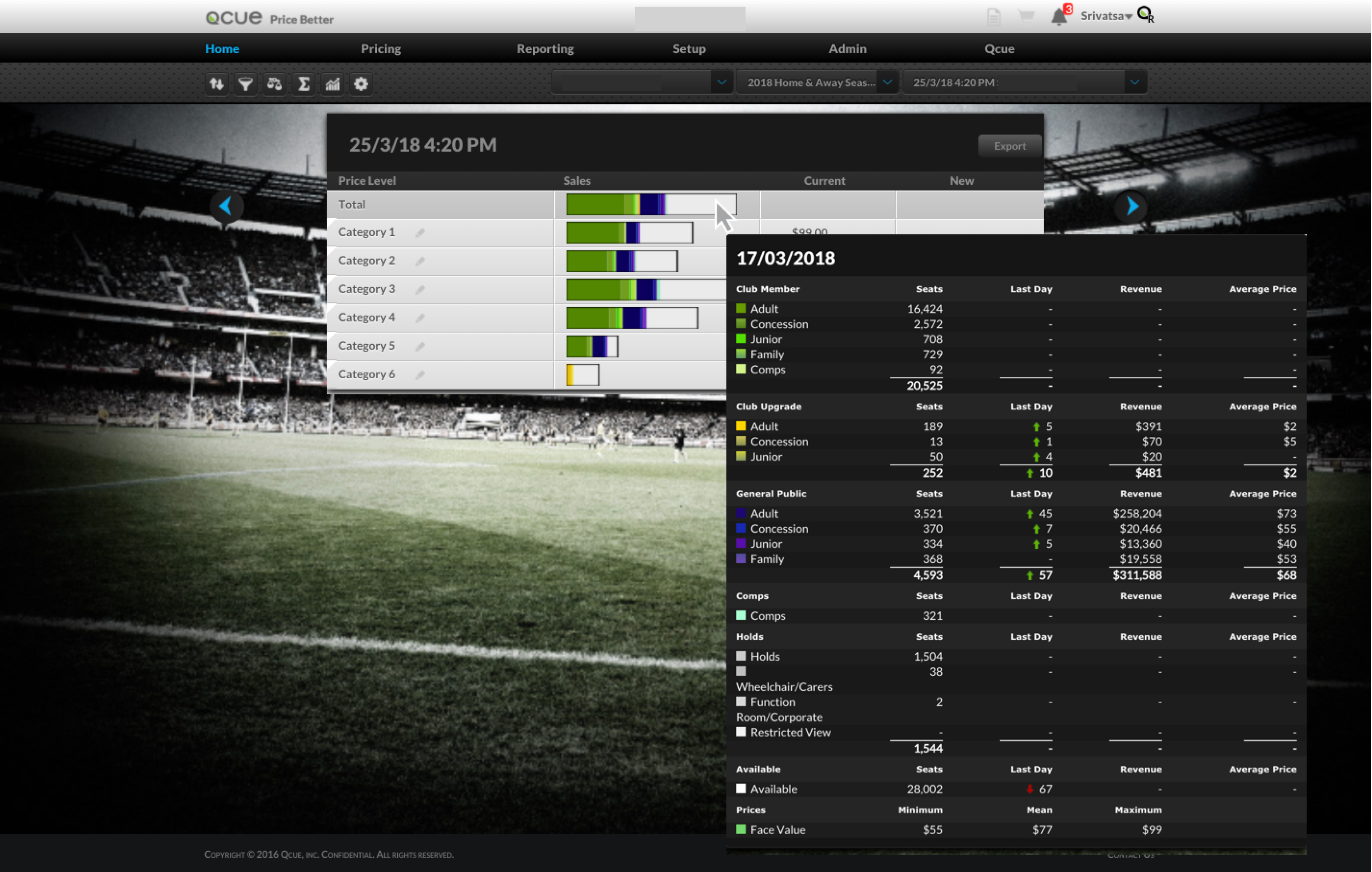
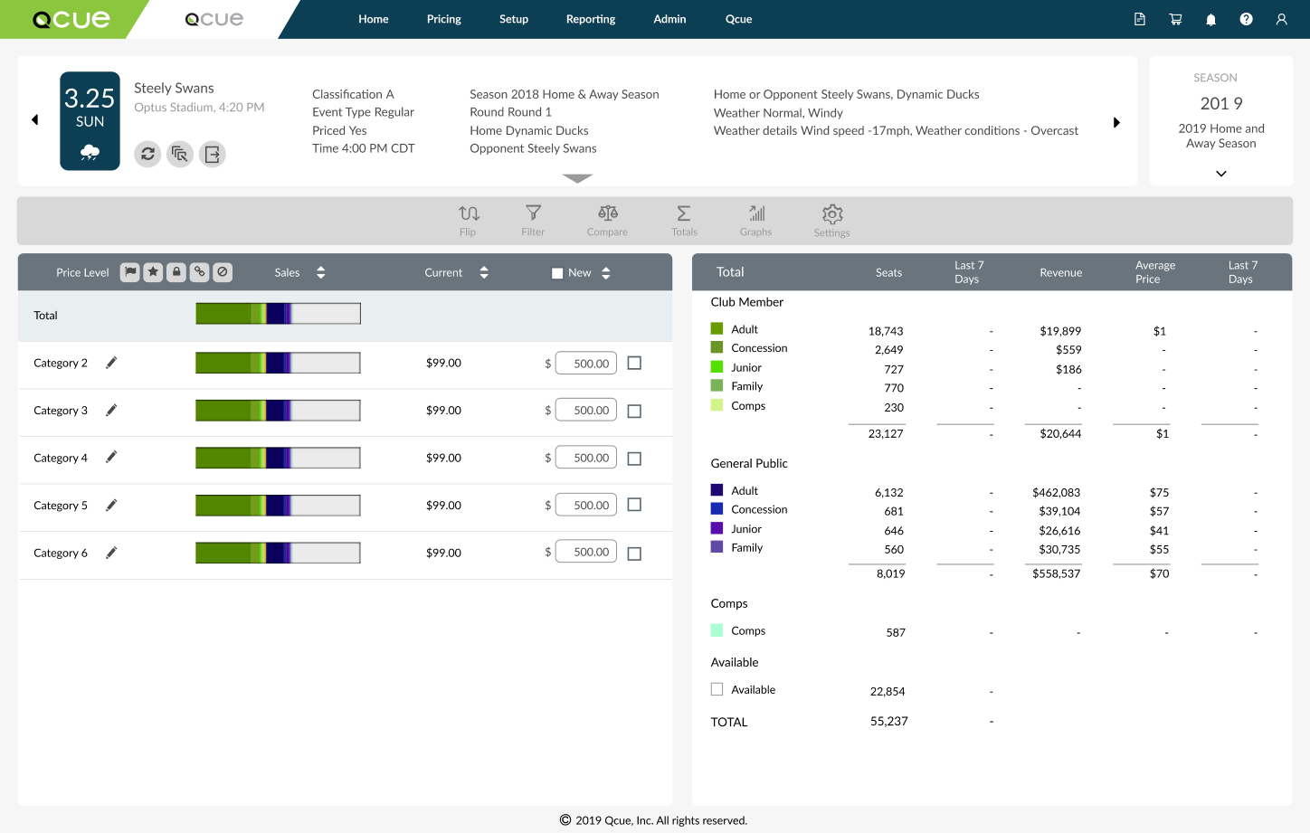
Event card
The event card is a primary point of navigation when it comes to selecting events. The card displays relevant event information useful for pricers. This includes the date of the event, the event title, location, time, and the number of tickets listed recently on various exchanges. To change events, a user can complete the action in two ways: using the left/right arrows to toggle the previous/next event or by clicking on the down arrow to trigger a modal with a list of selectable events and search filters.


Listing table
Users can price tickets through the listing table. Tickets are listed as records on a section by section basis. Records can be sorted based on desired columns. Price changes can be made by clicking on a cell and entering a value. Submitting price changes are added to the price cart where users can review their changes.
Pricing filters
Users can view their price distribution across sections and market movement for a given event through this panel. Weekly and daily metrics are shown here. To access the price distribution graph, users would need to click on the arrows or the carousel dots to cycle through panels. Additionally, users can filter sections of the table through a dropdown within this panel.

Research insights

Poor placement & unused visual elements
Pendo usage analytics showed that a few features were not used as expected. Users were unaware that these features existed. A few didn't use them as intended while a few others showed little interest.

Lack of responsiveness
An audit revealed that the application was virtually unusable in its mobile state. Application responsiveness also took a hit when handling multiple price submissions to the cart.
THE APPROACH
Prioritize and iterate
The research insights showed that the pricing page was lagging behind in multiple areas, quite literally. I needed to prioritize my tasks as we had planned development updates to the page. With these tasks, my aim was to:
- Create simple and clean visual elements
- Reduce clutter
- Question the use-case of certain features
- Leverage the technology update to React
- Sanitize controls and filters
These priorities helped identify 3 core sections of the page that needed my attention.
Intuitive event cards showing clearer feedback and easy navigation.
Mobile responsiveness empowering users to make price changes on the go.
De-cluttering pricing filters and adjusting context to the listing table.
Clean and clear navigation across pricing information panels.
Reducing visual noise
I had iterated through a few versions of the pricing information panels. While testing the pricing page, we found that users had difficulty in navigating to the price distribution graph. A few would use the carousel dots while a few others would use the arrows. One of my first iterations included doing away with the controls and fitting the graph within the same panel. In theory, this made sense since the pricing filters were moved to the table, however, upon further analysis, I found that users got distracted by the data visuals and could not discern the information properly. To reduce cognitive load, I converted the controls to tabbed navigation and moved out-of-context elements out of the panel.

Context-driven pricing filters
While analyzing the sections of the page, I found that several filters within the pricing information panel had no context. This meant actions performed using the filters affected elements in a different location of the page with little feedback and notification. As a result, users never sought to use those features. I moved the filters above the listing table as they affected the data within the table directly. I also ran through a few concepts, back-and-forth discussions with the CS team on the usage of a few feature icons. Eventually, we decided to streamline the process by reducing the number of filter options (Hick's Law), add suitable tooltips and affordance, and updated the table to a virtualized table of records. This also allowed for lazy loading and improved performance.

THE APPROACH
Simplifying the mobile workflow
There was a huge demand for a mobile version of the distribution application. We felt like a lot of features packed into the application were not tailored for the mobile experience. Given this revelation, I decided to rethink the information architecture of the mobile site and generate a compact, yet purposeful experience for users.
We decided to retain the homepage/dashboard page which serves as the landing page upon initial sign in. This page is a great way for users to have a snapshot view of their important metrics.
Given that pricing is the key task, we retained the crucial aspects of the pricing page ꟷ search & filter of events, edit and submitting prices to the cart, bulk price submissions and lightning mode.

THE DESIGN SYSTEM
Building for consistency
Creating a consistent design language that encompasses Qcue's products. Qx Design is the result of that vision and strategy - a design system that not only helps maintain a common theme for all Qcue products but also encourages collaborative efforts with developers in managing their UI components. I created Qx keeping ease of use and atomicity in mind.

One of the key reasons for creating Qx Design was to drive a sense of uniformity throughout our products. We had a product catering to customers in the primary ticketing market called Pricing. With the creation of Qx Design, I wanted to create a consistent user experience across products. The system helped refine the visual interface for Pricing and improve upon its functionality.
Qx Design System impact: before & after applying refreshed style guide to the Pricing application
FROM PROBLEM TO SOLUTION
Pricing made easier
This project was divided into several micro tasks as it was not possible to refactor the entire page at once. Technical complexity and the critical nature of the page resulted in several testing and feedback sessions with stakeholders to improve the page.
Quick filters
Minimizing cognitive load with a reduced set of table filters helps maximize usability. The zone dropdown is now devoid of any hidden filters except the zone filter which filters the zones down to those that have active inventory. Additional overhead context options are shown when selecting records from the table.

Raised event card
Given the lack of any visual feedback for a click interaction, I increased the drop shadow for the card. This gave a 'raised button' effect which proved successful in my tests where users were easily able to discern the card and its functionality. I also moved the 'Event refresh' icon from the map to the event card as the context fit more organically.
The mobile experience
Log in to the application and you land on the Dashboard where you can view your most relevant metrics across all events. Navigate to the Pricing page and price tickets as you could on the desktop version. Send your prices to the cart and have them ready for submission. Select and filter events by clicking on the card. The intent of the experience was to make pricing quick and snappy.
THE IMPACT
A better experience
After running usability tests and iterating the designs, we released the redesigned pricing page to our users. This was met with a lot of praise and satisfaction. Within the first month of release, more users were making price changes on the mobile website and had noticed a drastic performance improvement.
26%
increase in feature adoption rate
67%
increase in product usage
Next steps &
Retrospective
01
Always the systematic approach
As a designer working on multiple projects at a time, the lines get blurred with respect to deliverables. Having a methodical approach in tracking deliverables helped streamline the process. Trello in this regard came in as a life-saver with recording tasks and artifacts while maintaining deadlines.
02
Seeking out early feedback
There are times as a designer when we get carried away with iterations and proceed ahead. Seeking early feedback from stakeholders helps validate our decisions and improve upon those iterations.
03
Advocating for good UX
Qx Design was born on the basis of strong design principles and fighting for good UX. While it wasn't easy, taking proactive steps and working hard for what's good helps build a stronger consistent system.