Intelligent Underwriting
A decision-support platform that turns fragmented underwriting data into structured, actionable insight.
ROLE
Lead Product Designer
SCOPE
0→1 underwriting web platform design
TIMELINE
Q2 2022
SUMMARY
What if underwriting decisions were guided, not fragmented?
Commercial underwriters were reviewing submissions across scattered documents, internal systems, and third-party data. The challenge wasn’t access to information — it was knowing which signals mattered, what needed attention, and how to move a submission forward.
I led the design of a 0→1 underwriting platform that brought submission context, insights, workflows, and business rules into one connected workspace.
What this led to
60%
reduced cycle time
25%
improved quote-to-bind ratio
~99%
faster quote generation
These gains helped underwriters respond faster, evaluate risk more consistently, and move more submissions through the quoting process.
PROBLEM
How might we help underwriters make faster, more confident decisions from fragmented submission data?
OUTCOME
A unified system for faster, insight-driven underwriting
Centralized submission workspace
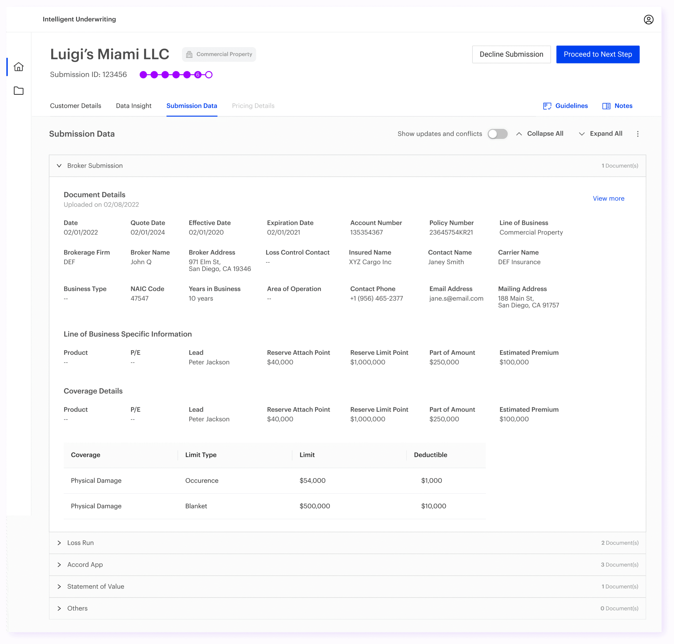
Bring all submissions, documents, and data into a single view for easier tracking and prioritization.
Data insights dashboard
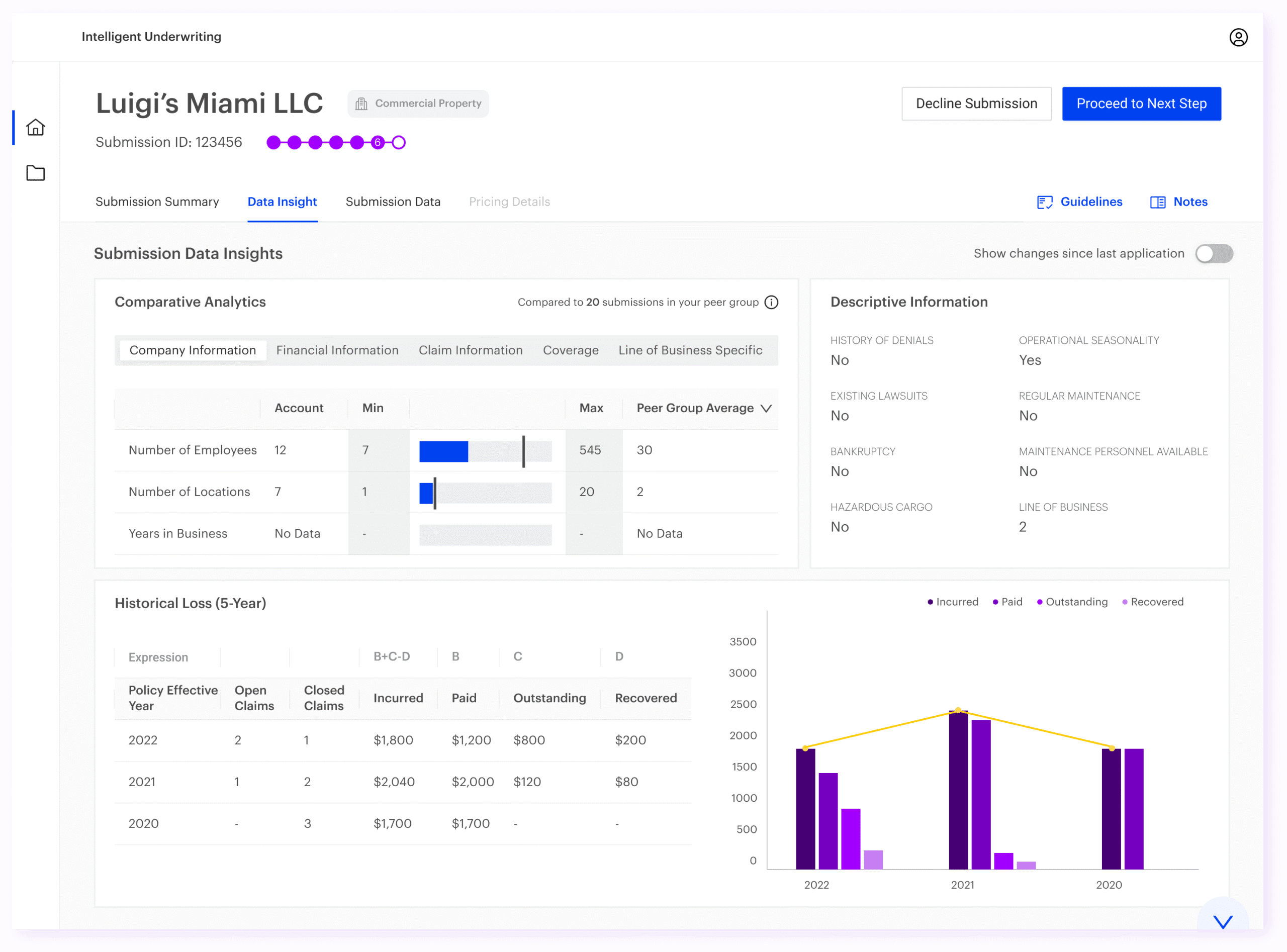
Provide a consolidated view of performance, risk distribution, and operational metrics.
Guided underwriting workflows
Structure the decision process step-by-step to reduce cognitive load and improve consistency.
SOLUTION
A unified underwriting workspace
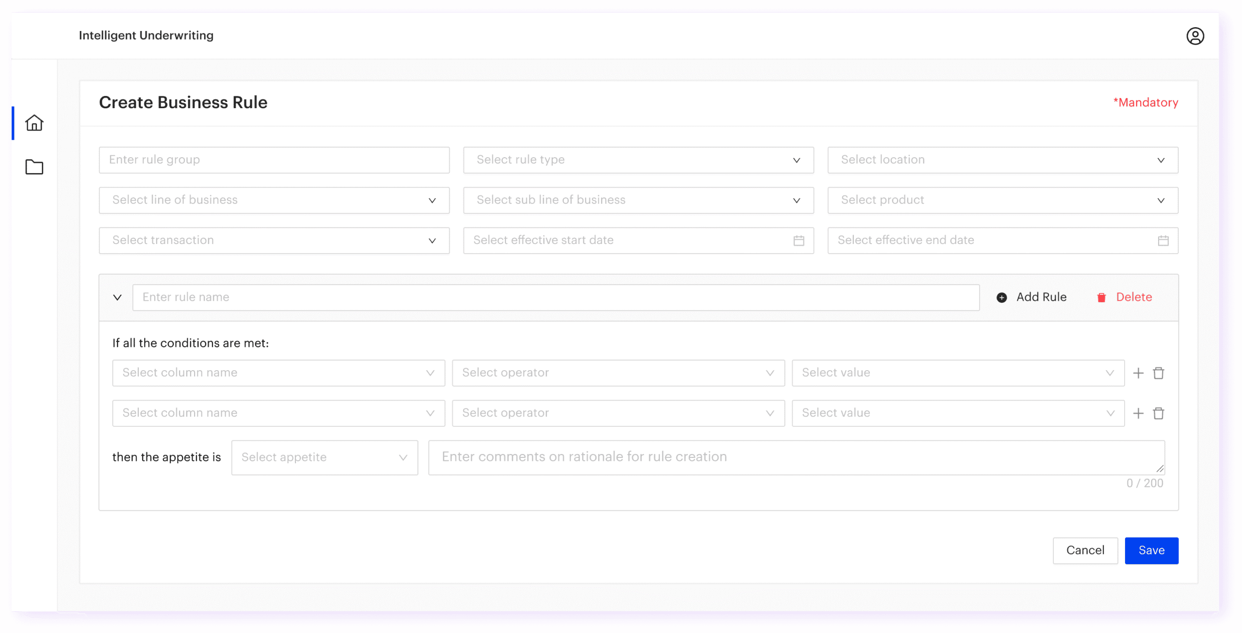
I designed a connected workspace that brought together submission context, insights, supporting data, workflow actions, and configurable business rules.
Designing the platform as a connected decision system
Underwriting decisions rarely happen on one screen. A submission moves through intake, review, risk assessment, decisioning, and follow-up, with underwriters constantly moving between documents, data points, insights, and business rules.
Instead of treating these as separate pages, I structured the product as a connected workspace: one that helped underwriters move from understanding a submission to review, to taking the next best action without losing context.
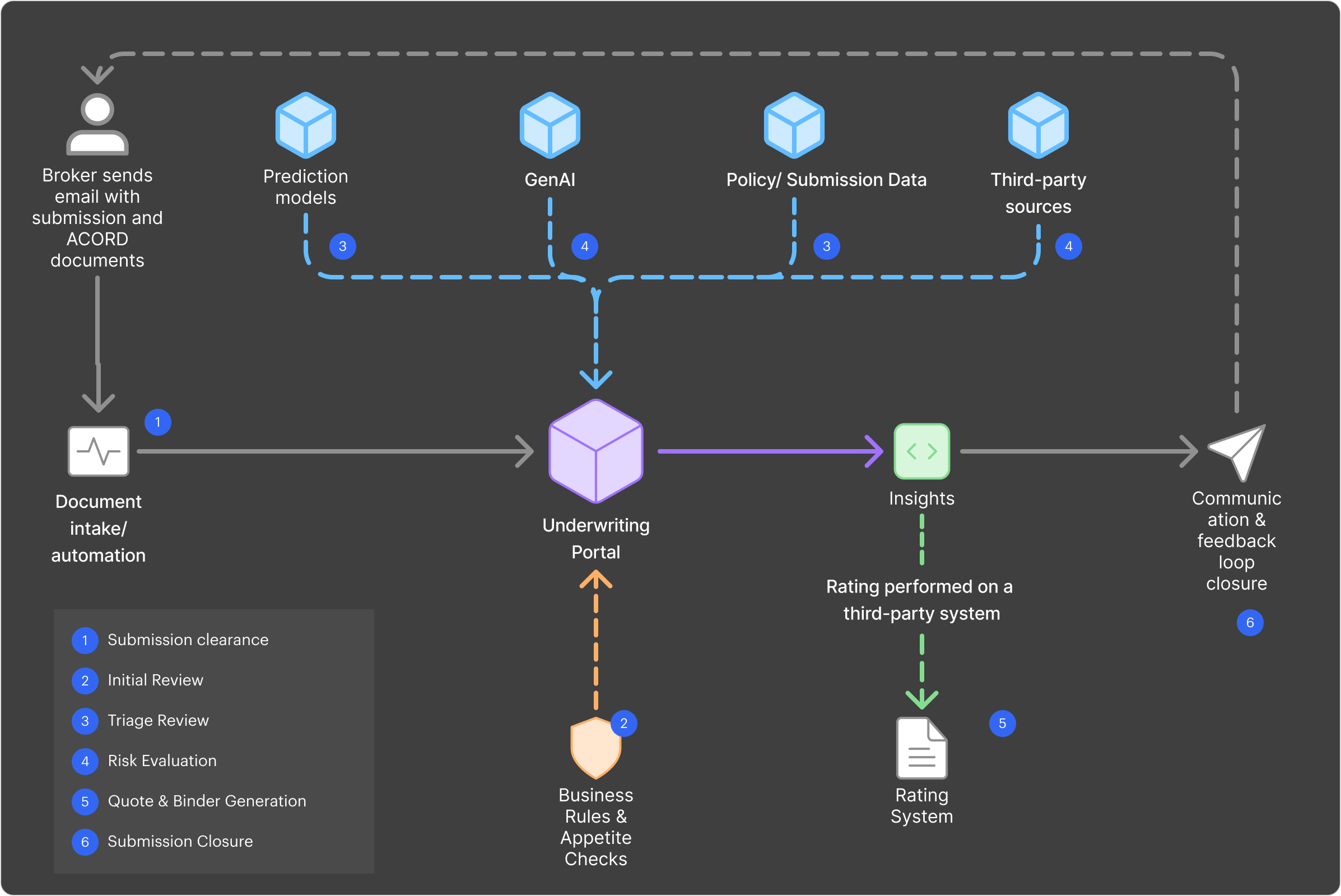
Final designs
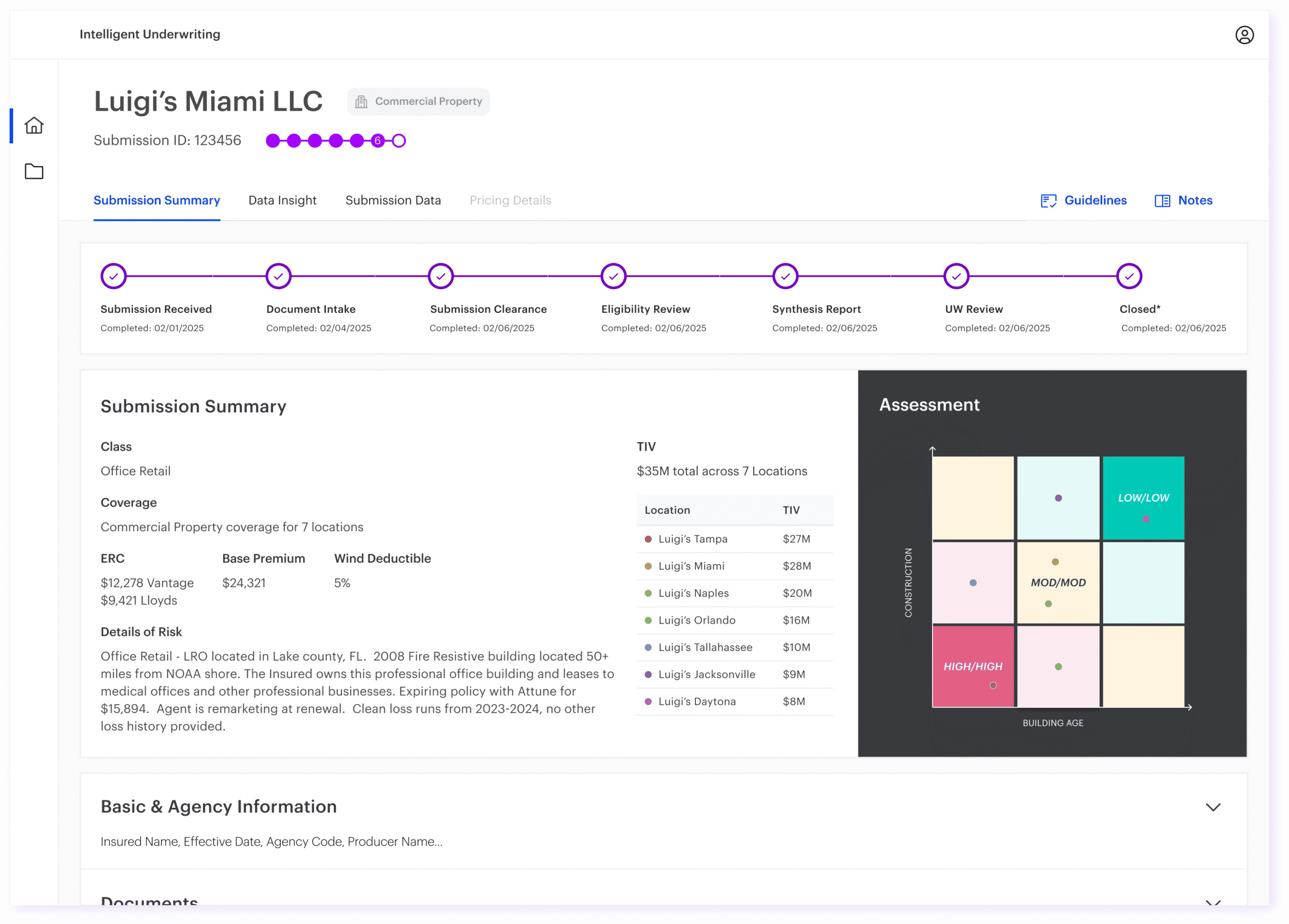
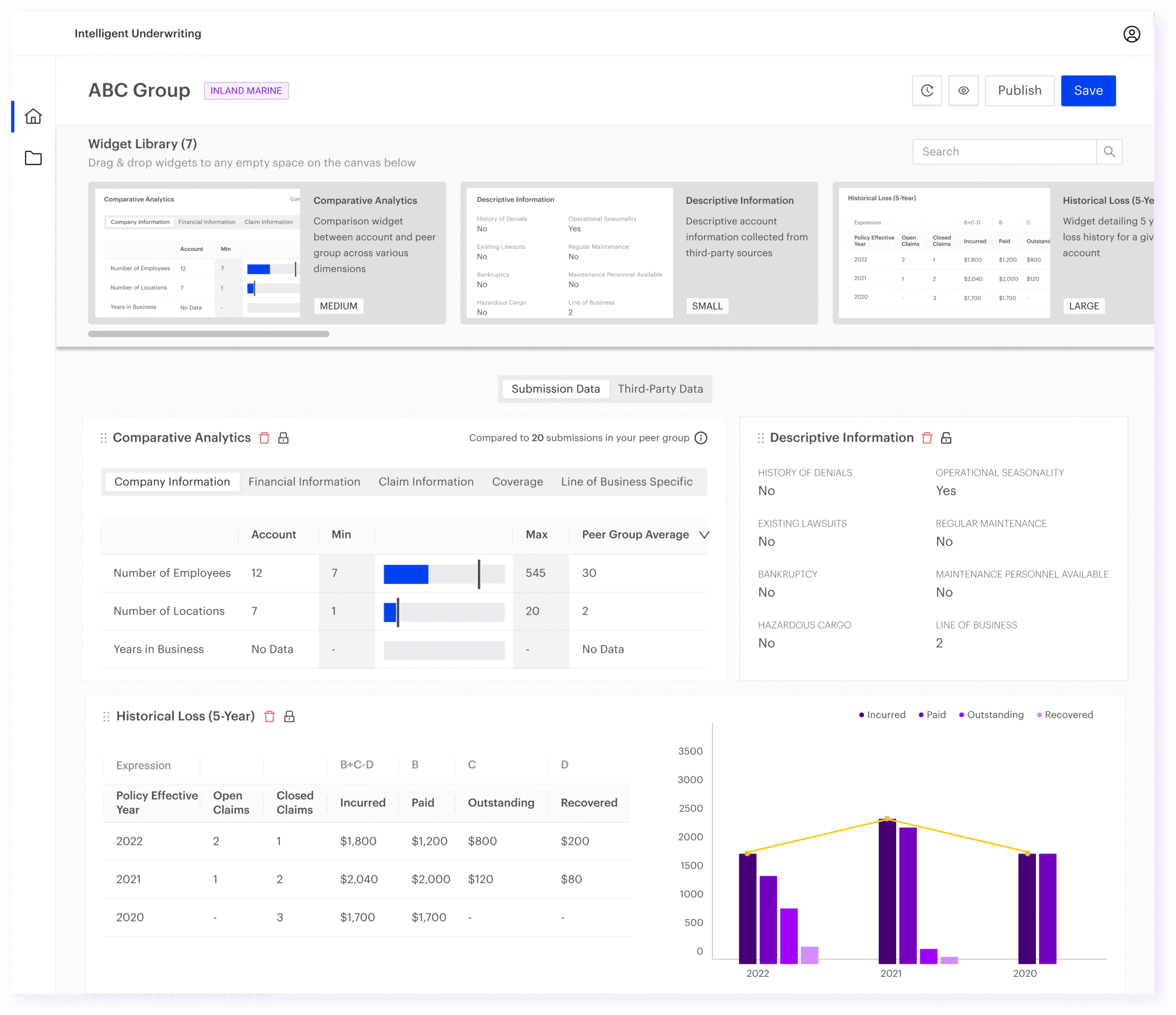
The final experience connected these areas across a modular platform, helping underwriters move from intake to insight to action without losing context.
I designed a set of interconnected modules and worked closely with cross-functional teams to deliver complex systems, such as the rule engine and document ingestion. Alongside this, I built a scalable design system aligned with Accenture’s brand, introduced role-based experiences, and created a modular insights framework with 40+ widgets to support flexible decision-making.
DEEP DIVE
Key design decisions
Three decisions shaped the platform: making progress visible, introducing layout rules, and redesigning widgets so the system could scale.
Decision 1: Making workflow progress visible
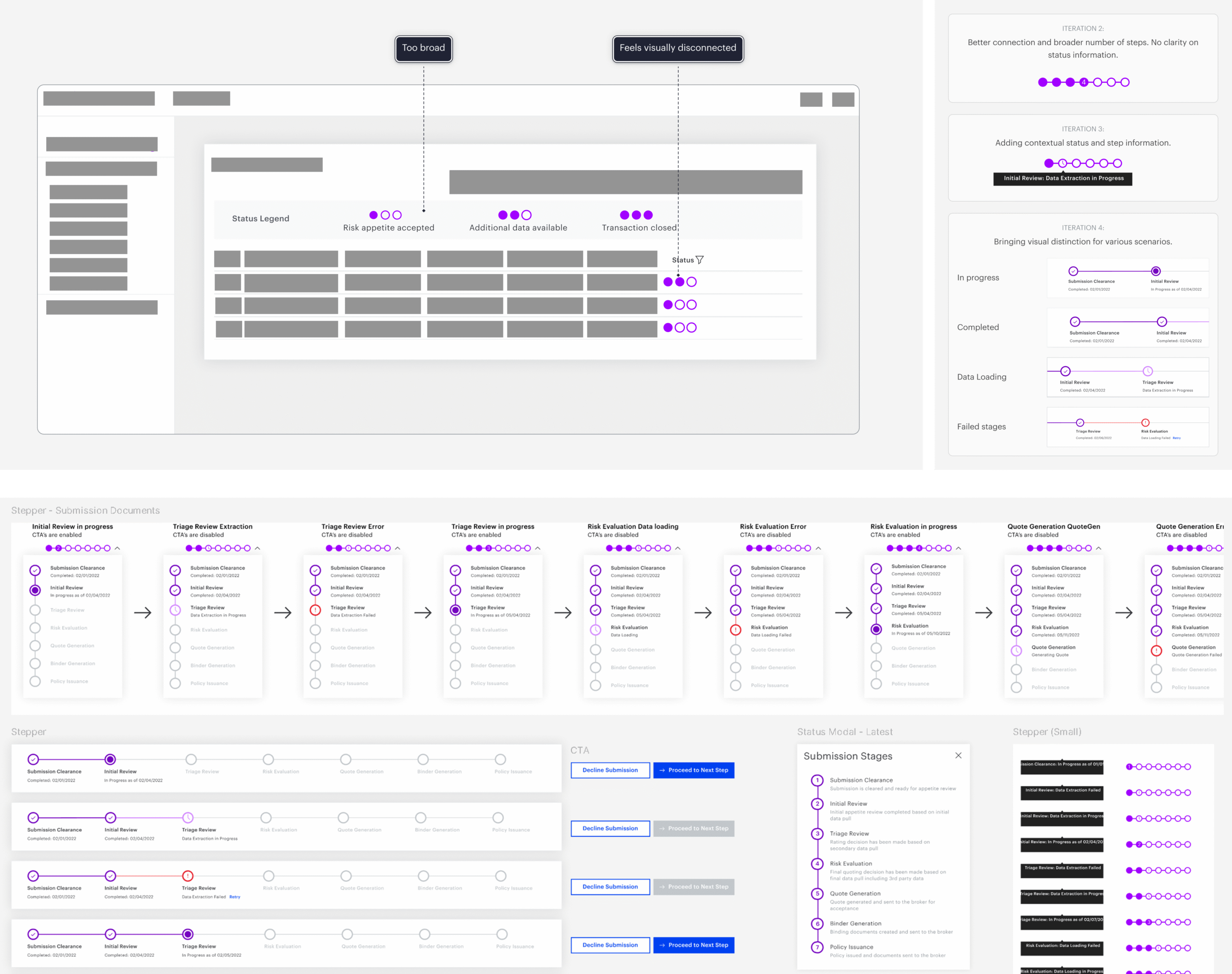
Underwriters needed to know where a submission stood, what was complete, and what needed action next. I introduced a compact stepper with status cues and contextual actions, giving teams a quick way to track progress without taking over the workspace.
What I explored
- A broader stepper with more visible stages
- A compact stepper that preserved workspace density
- Status cues for in-progress, completed, failed, and delayed stages
- Contextual CTAs tied to the current stage

Decision
I moved toward a compact workflow stepper with contextual status cues and progressive detail, so users could scan progress quickly but still inspect stage-level information when needed.

Trade-off
A stepper can make a workflow feel rigid, so the design needed to ensure the workflow felt structured without forcing every submission into a rigid linear path.
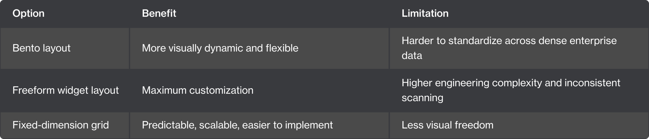
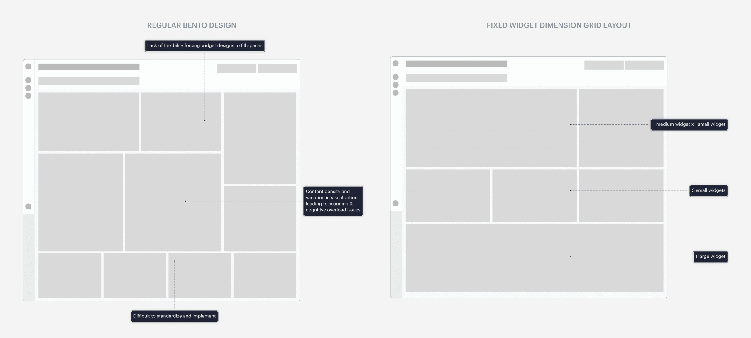
Decision 2: Choosing a grid over a bento layout
The dashboard needed flexibility, but too much visual freedom made the experience harder to scan, compare, and build consistently. I moved from a bento-style exploration to a controlled grid system with fixed widget dimensions.
Why it worked: It gave underwriters enough flexibility to configure their workspace while keeping the layout predictable across modules.
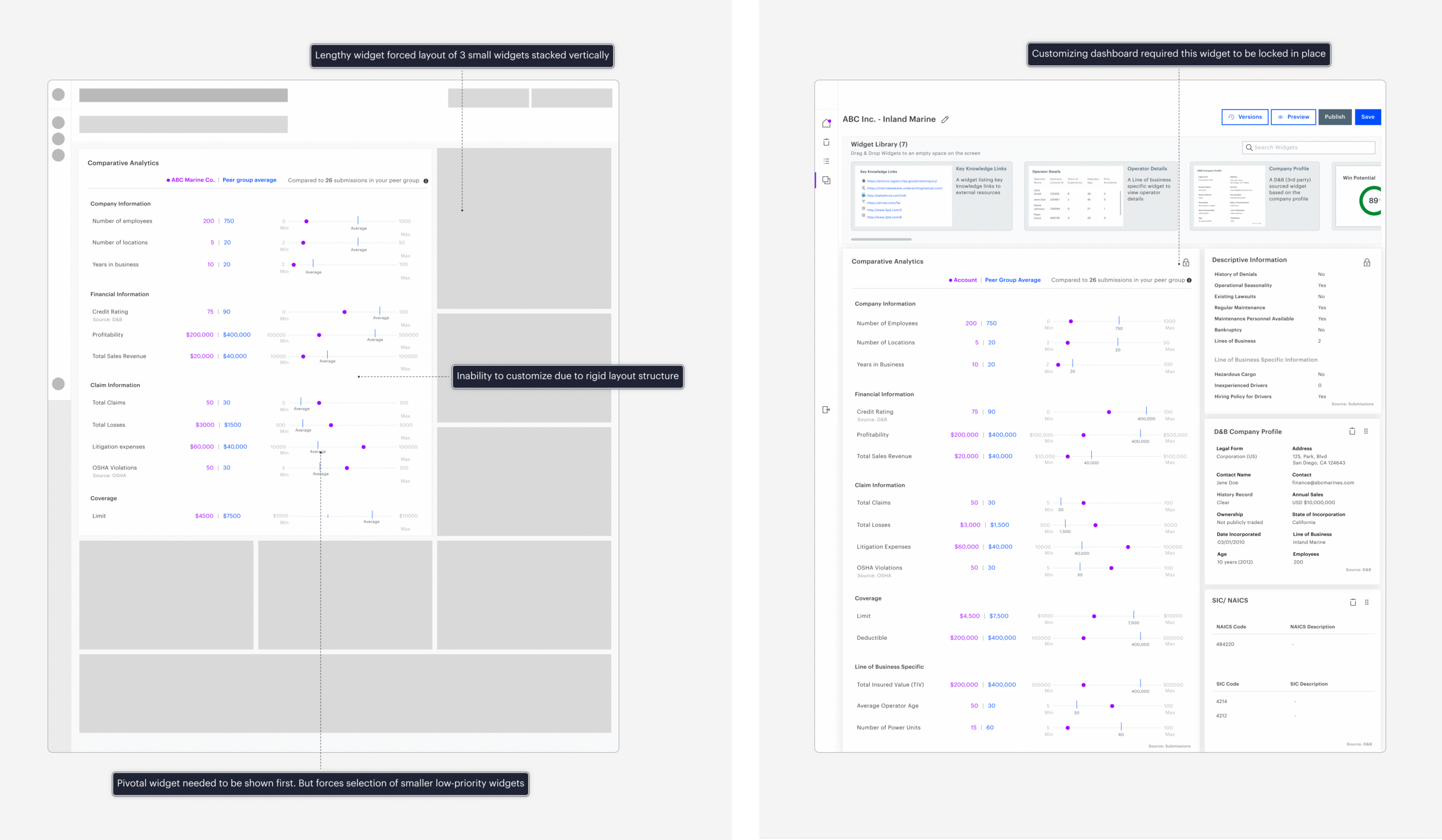
Decision 3: Redesigning a widget to unlock the system
The comparative analytics widget originally needed a large locked layout, which limited customization and broke the grid rules. I redesigned it into a smaller bullet-graph format that preserved comparison while fitting the standardized widget sizes.
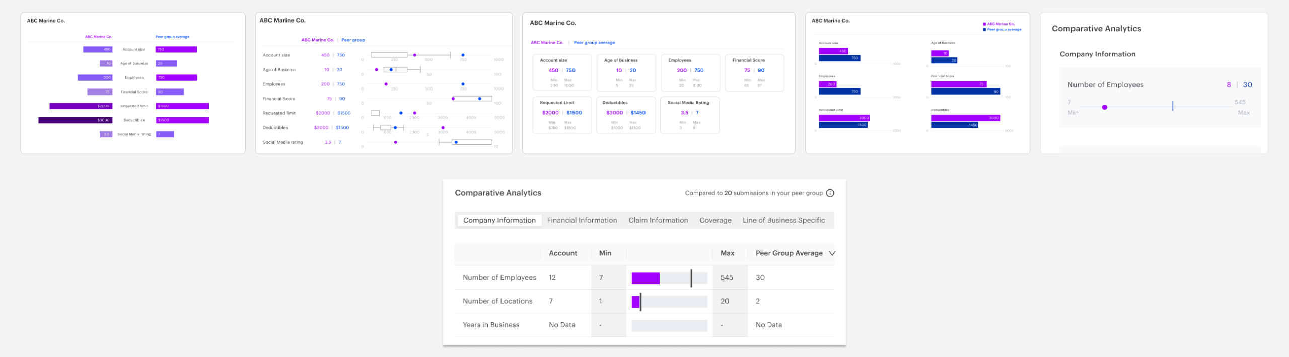
Why this mattered
The decision allowed the grid framework to support more widgets without one component dictating the structure of the entire page.
Trade-off
Less data visible at once, but a more scalable, configurable, and engineering-friendly system.
RETROSPECTIVE
What I learned
Designing for decisions, not dashboards
The goal wasn’t to show more data. It was to help underwriters identify what mattered and act with confidence.
Flexibility needs boundaries
The grid system showed me that enterprise customization works best when it has clear rules.
Automation still needs human control
In high-stakes workflows, speed only matters if users can understand, trust, and override the system.
Resume
srivats.rao@gmail.com
© 2020 Srivatsa Rao