Dynamic Pricing Engine
A platform redesign that simplifies ticket pricing workflows, improves performance, and makes key actions easier to complete across desktop and mobile
ROLE
Product Designer
SCOPE
Responsive web and mobile experience
TIMELINE
Q3 2019

SUMMARY
What if pricing decisions felt fast, clear, and effortless?
Qcue's Dynamic Pricing Engine helps users price and manage inventory in the secondary ticketing market, where quick decisions directly affect outcomes. As teams cycle through multiple events each day, the pricing page becomes the center of their workflow.
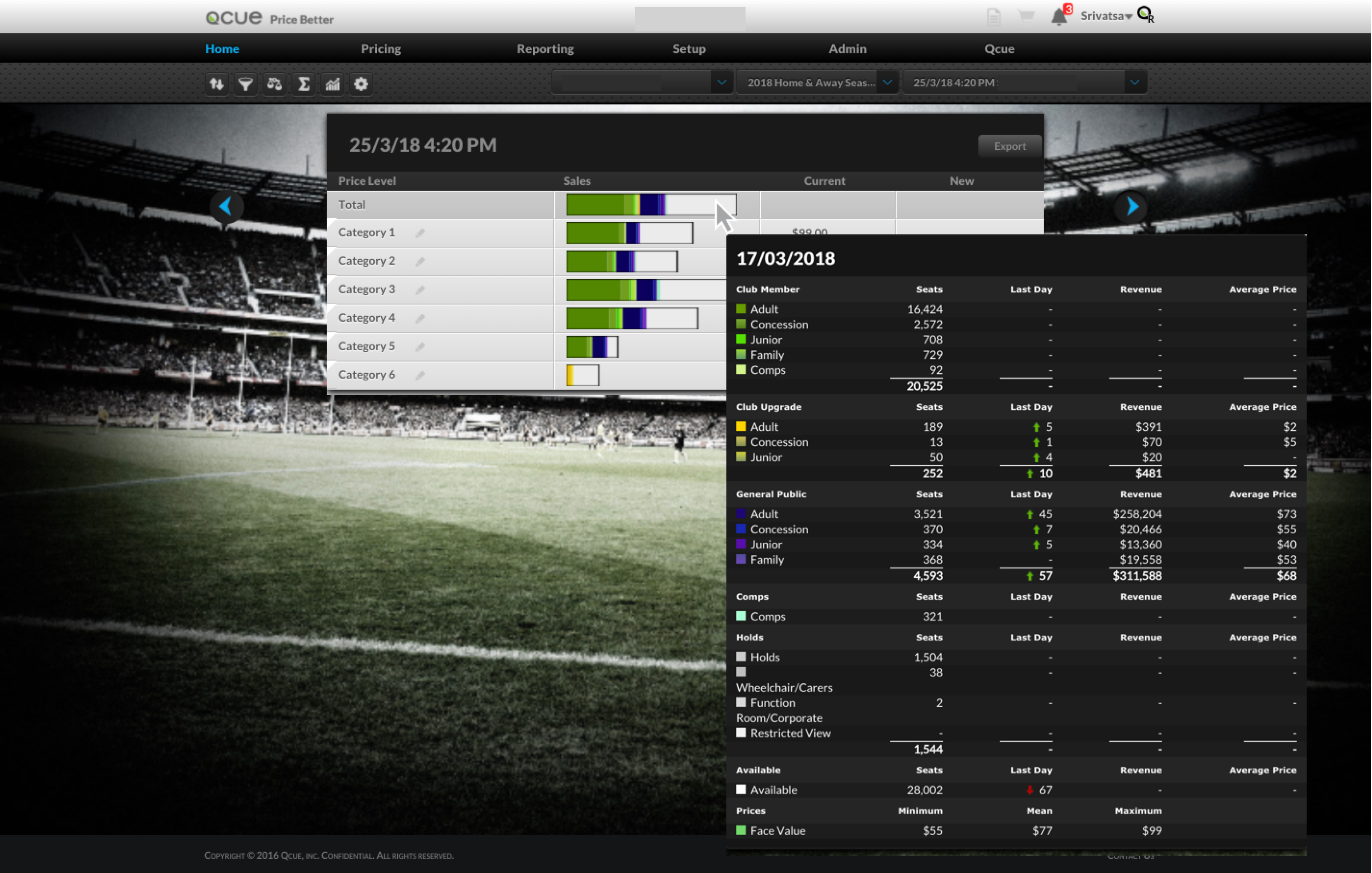
Users relied on the pricing page to make high-frequency decisions, but the experience had become cluttered, difficult to navigate, and hard to use efficiently. Important features were ignored, key actions lacked context, and the mobile experience was nearly unusable.
The opportunity was to simplify the workflow, reduce cognitive load, and make pricing actions easier to complete across devices without losing the depth needed for real-time decision-making.
My Role
As the sole product designer, I led the work end to end from research and UX audit to interface redesign, mobile information architecture, and the creation of Qx Design to support consistency across products and collaboration with developers.
What this lead to...
26%
increase in feature adoption
67%
increase in product usage
PROBLEM
How might we simplify pricing workflows so users can act quickly without losing critical context?
RESEARCH
Understanding user behavior
I interviewed our client partners, deep-dived into our analytics data, and conducted an in-house contextual inquiry with my customer success team to understand the gaps and bottlenecks in the user journey. Additionally, I conducted a UX audit of our key interactive components to identify usability issues.
Common painpoints
Low discoverability and clarity
80% of users didn’t use several features due to poor placement, lack of clarity, and dense layouts.
Friction in core workflows
Disconnected controls and navigation patterns slowed down key pricing actions.
Limited usability at scale
Mobile constraints and performance issues disrupted high-frequency workflows.
DESIGN DECISIONS
Refining the experience, one friction point at a time
These insights shaped a series of focused design decisions aimed at reducing friction and improving clarity across the pricing workflow. Rather than a complete overhaul, I addressed key pain points incrementally by refining how information, controls, and interactions were structured.
Simplifying pricing panels
The pricing panel was difficult to navigate due to clutter and unclear controls. I simplified the structure by removing unnecessary elements and introducing clearer navigation patterns, making information easier to interpret.

DESIGN DECISIONS
Making filters more intuitive
Filters were disconnected from the content they controlled and often ignored. I repositioned them closer to the listing table, reduced complexity, and made them more contextual to improve usability.

DESIGN DECISIONS
Rethinking the mobile workflow
The desktop experience didn’t translate well to mobile. I restructured the mobile flow to focus on essential actions, enabling users to review events, edit prices, and act quickly on the go.

DESIGN SYSTEM
Building for consistency and scale
To support the redesign, I developed a design system that introduced a consistent visual language and reusable components across the platform. This improved collaboration with engineering and ensured a more cohesive experience across products.

SOLUTION
Pricing made easier
A streamlined pricing system that brings together workflows, insights, and actions,, making it easier for users to review, decide, and act quickly.
Simplified pricing interface
Redesigned the core pricing layout to reduce visual clutter and improve hierarchy, ensuring that key actions and information are immediately visible. This made it easier for users to scan listings, understand context, and make quicker pricing decisions without unnecessary distractions.

Improved event cards
Refined event cards with clearer hierarchy, stronger visual feedback, and improved affordances to make interactions more intuitive. This helped users quickly identify important details and interact with events more confidently.

Contextual filters
Repositioned and simplified filters to appear closer to the data they control, making them easier to discover and use during active workflows. This reduced friction and allowed users to refine results without breaking their flow.
Mobile-first workflows
Restructured the mobile experience to focus on essential actions like reviewing events, editing prices, and submitting updates. This enabled users to manage pricing on the go without being overwhelmed by desktop-level complexity.
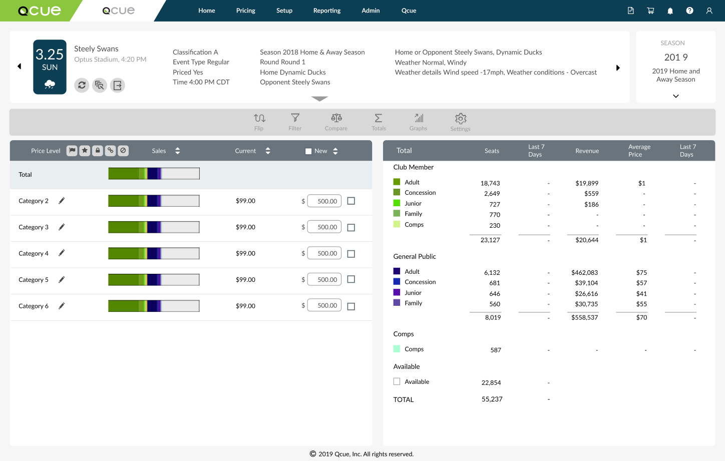
Qx Design System impact: before & after applying refreshed style guide to the Pricing application
RETROSPECTIVE
What I learned from this project
Clarity drives speed
Simplifying interfaces helps users make faster decisions. I realized that bombarding the user with several actions and controls on the page was not the solution.
Focus beats feature overload
Not everything needs to be surfaced at once. Prioritization matters and is pivotal to the success of any project.
Designing for real workflows
Understanding how users actually work leads to better outcomes than designing in isolation.
Resume
srivats.rao@gmail.com
© 2020 Srivatsa Rao